Client: Carmen's Best Ice Cream
Project: Develop logo and packaging for alcohol-infused ice cream
Project: Develop logo and packaging for alcohol-infused ice cream
When the owners of Carmen's Best Ice Cream approached me to help them create the logo and packaging for their new line, I was extremely ecstatic. I really love Filipino brands that are carving their own niches, and Carmen's Best is really the best!
They wanted to create a new ice cream line that was alcohol-infused and targeted to young professionals and the bar-going crowd (pre-pandemic). The brief was to have something mature, minimal, and really different from their Carmen's Best brand identity.
They wanted to create a new ice cream line that was alcohol-infused and targeted to young professionals and the bar-going crowd (pre-pandemic). The brief was to have something mature, minimal, and really different from their Carmen's Best brand identity.
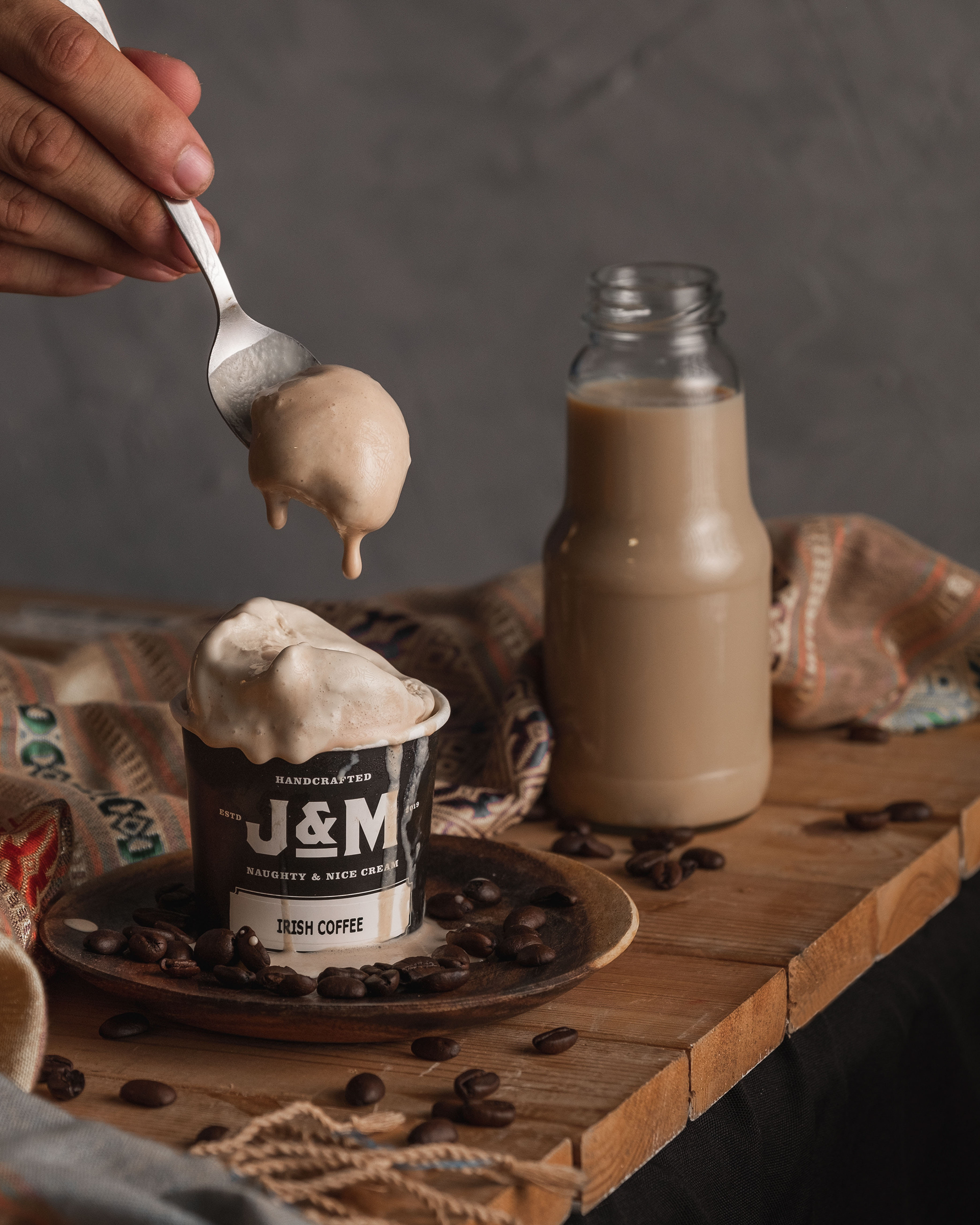
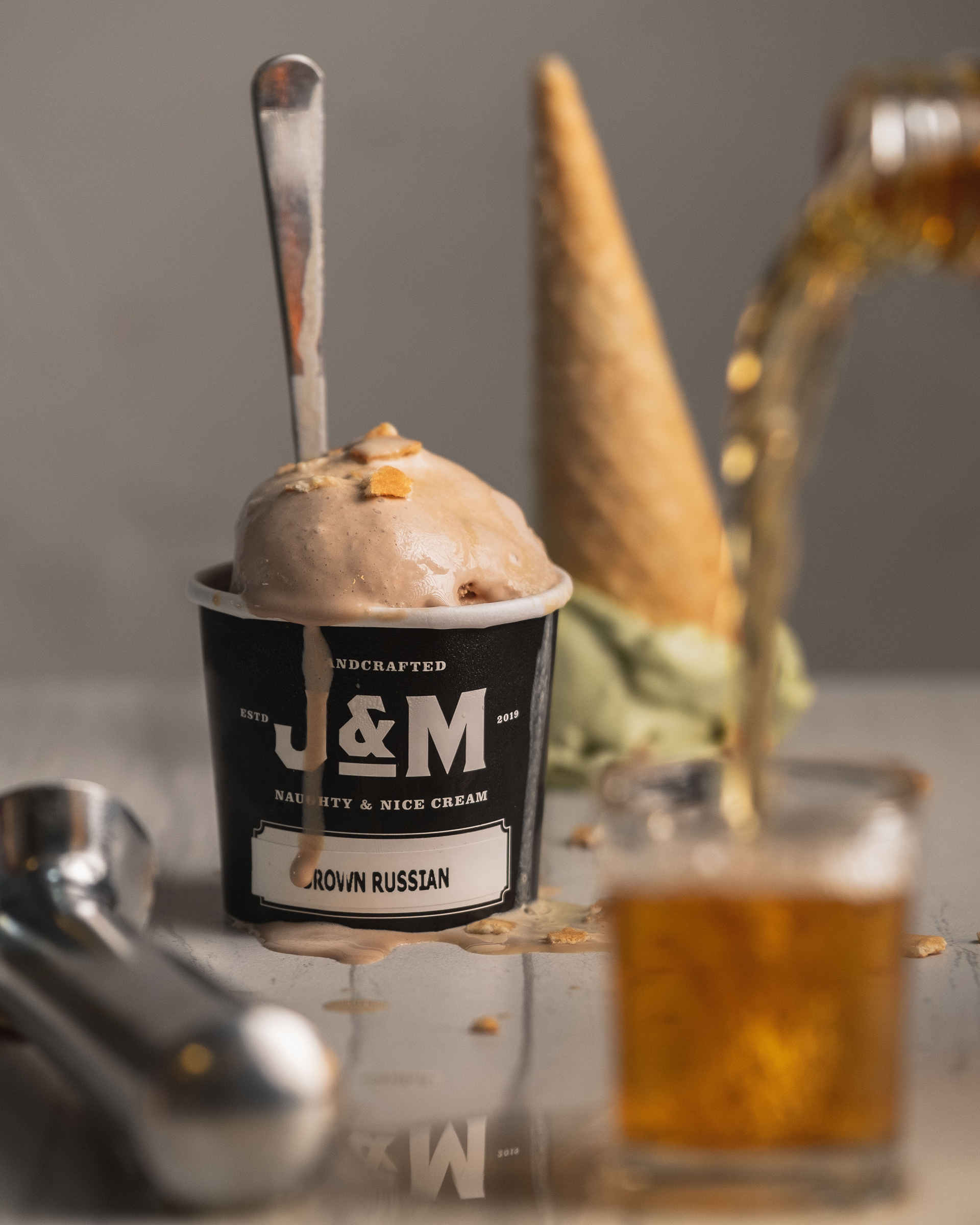
My solution was to take inspiration from alcohol labels and typography to create a bold monogram. We also decided to go with a black and white color palette to keep things simple and premium-looking. We wanted it to look more like an alcohol brand than an ice-cream brand.
Since they were just testing out the initial run, we created a single packaging system that allowed them to use multiple flavors with just one cup design. Flavors were added on as stickers. I wanted to create sticker labeling similar to liquor labels on bottles.
Depending on how the market responds, they would then create a multi-package system with actual flavors printed on the cups, among other things.
Depending on how the market responds, they would then create a multi-package system with actual flavors printed on the cups, among other things.
