Client: Cyrus Copeland (Author)
Art Director : Jason Booher | Penguin Random House
Awards: AIGA/DesignObserver 50 Covers Selections, Adobo Design Awards
Art Director : Jason Booher | Penguin Random House
Awards: AIGA/DesignObserver 50 Covers Selections, Adobo Design Awards
BRIEF:
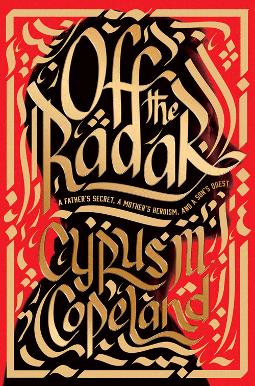
Create a book cover for a true story of an American man living in Iran in the 1970's, charged and imprisoned for espionage. The overall feeling of the cover should be: intrigue, drama, and cultural identity--and culture clash. The Iranian revolution of 1979 and attendant hostage crisis signaled a rift between east and west. Inasmuch as the author is from both worlds, and the protagonist is his father, he asked that the cover reflect this shifting landscape in ways that are truthful and dynamic without being pandering or prejudicial. He wanted a "fresh approach to Iran"--no hostage imagery, burning American flags or glowering mullahs that became emblematic of that period. Most important? That the cover invite you to pick it up.
Create a book cover for a true story of an American man living in Iran in the 1970's, charged and imprisoned for espionage. The overall feeling of the cover should be: intrigue, drama, and cultural identity--and culture clash. The Iranian revolution of 1979 and attendant hostage crisis signaled a rift between east and west. Inasmuch as the author is from both worlds, and the protagonist is his father, he asked that the cover reflect this shifting landscape in ways that are truthful and dynamic without being pandering or prejudicial. He wanted a "fresh approach to Iran"--no hostage imagery, burning American flags or glowering mullahs that became emblematic of that period. Most important? That the cover invite you to pick it up.
SOLUTION:
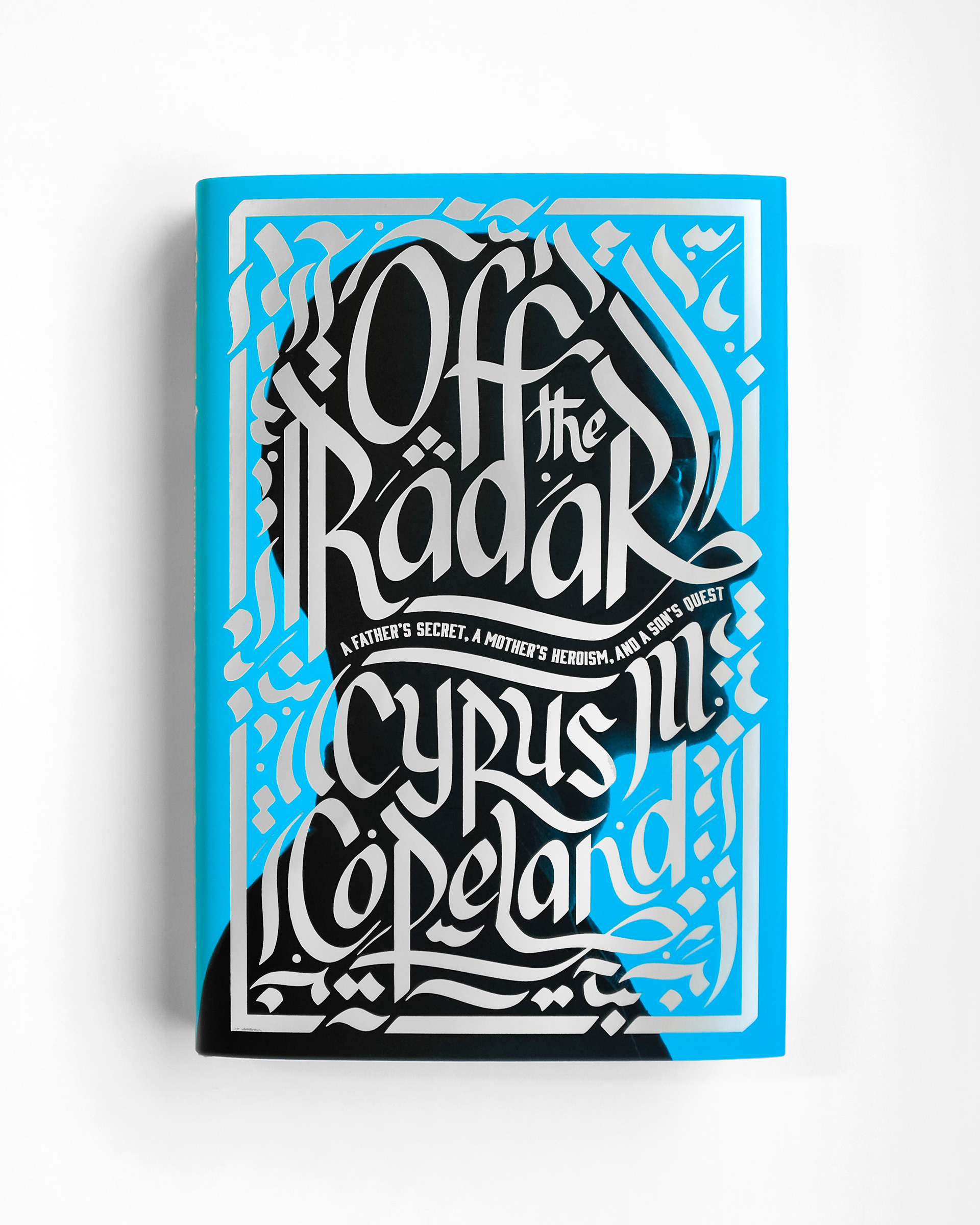
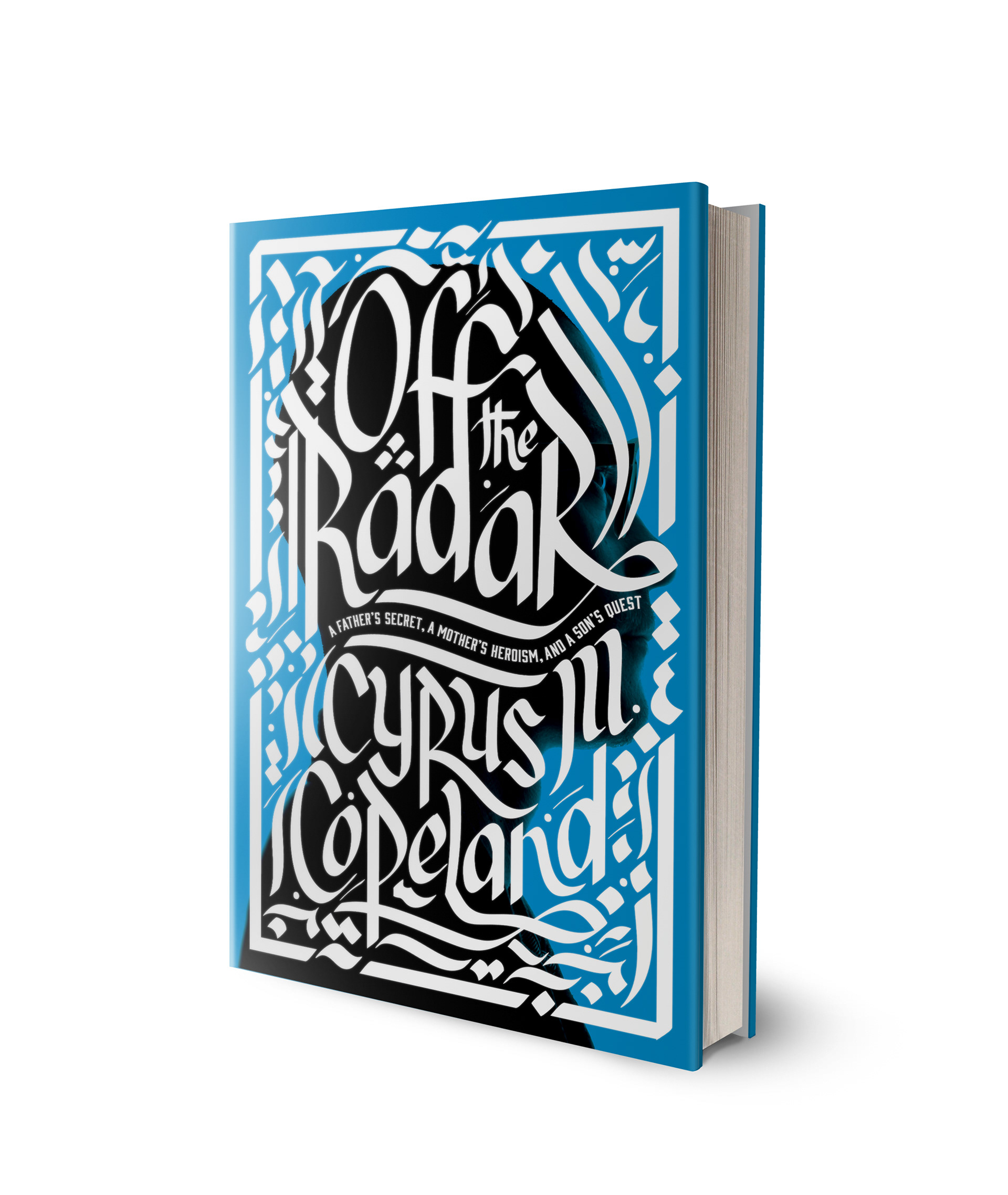
A typographic solution that evokes the style of traditional Persian calligraphy but in a modern western vibe--signifying the dynamic of two different cultures, and signaling that the story unfolds in Iran. (The Persian locale is further underscored by the turquoise and silver color palette.) The calligraphy creates a sense of entrapment by making the title not only the title, but also a prison for the protagonist-silhouette. Lastly, the silhouette implies a man who is himself "off the radar" and possessed of the "secret" in the subtitle--the sum of which creates a sense of a dramatic story about to unfold.
A typographic solution that evokes the style of traditional Persian calligraphy but in a modern western vibe--signifying the dynamic of two different cultures, and signaling that the story unfolds in Iran. (The Persian locale is further underscored by the turquoise and silver color palette.) The calligraphy creates a sense of entrapment by making the title not only the title, but also a prison for the protagonist-silhouette. Lastly, the silhouette implies a man who is himself "off the radar" and possessed of the "secret" in the subtitle--the sum of which creates a sense of a dramatic story about to unfold.
PROCESS
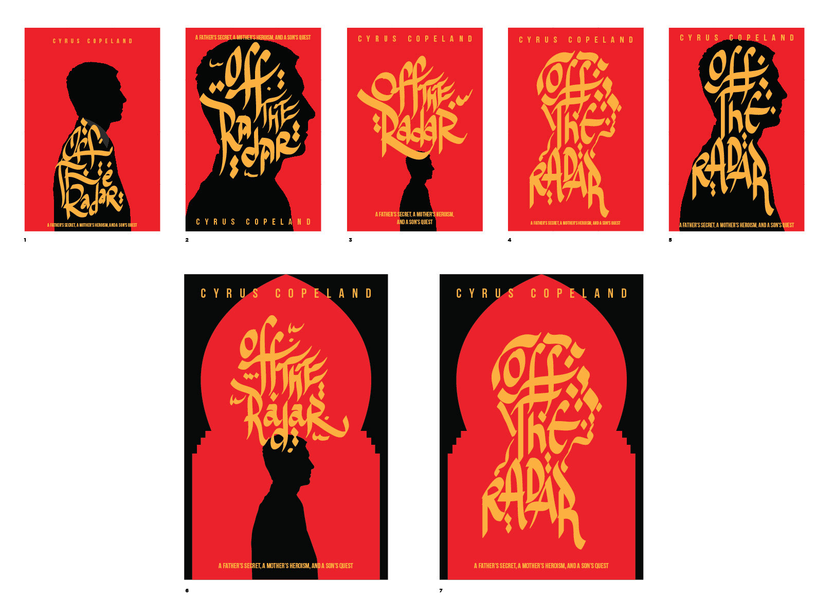
The initial sketches were shown with 4 original directions (above). All calligraphy was done directly in Adobe Illustrator, so we could iterate quickly. I had 2 weeks to finish the book cover.
We wanted to create a sense of suspense with the silhouette, mixed in with Iranian influence with the calligraphy. The author chose the first direction.
At this point, it was about creating samples of color combinations, having the silhouette, without, etc.
At this point, it was about creating samples of color combinations, having the silhouette, without, etc.
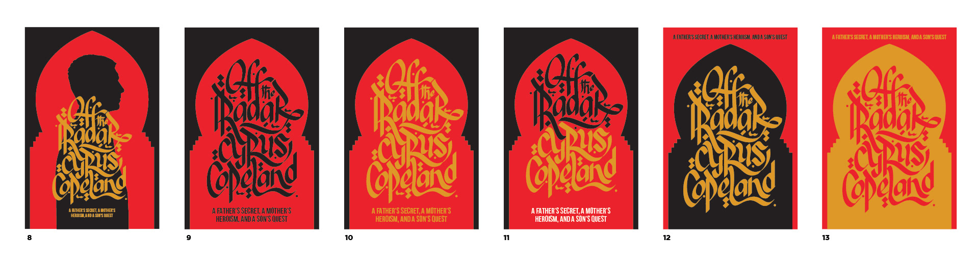
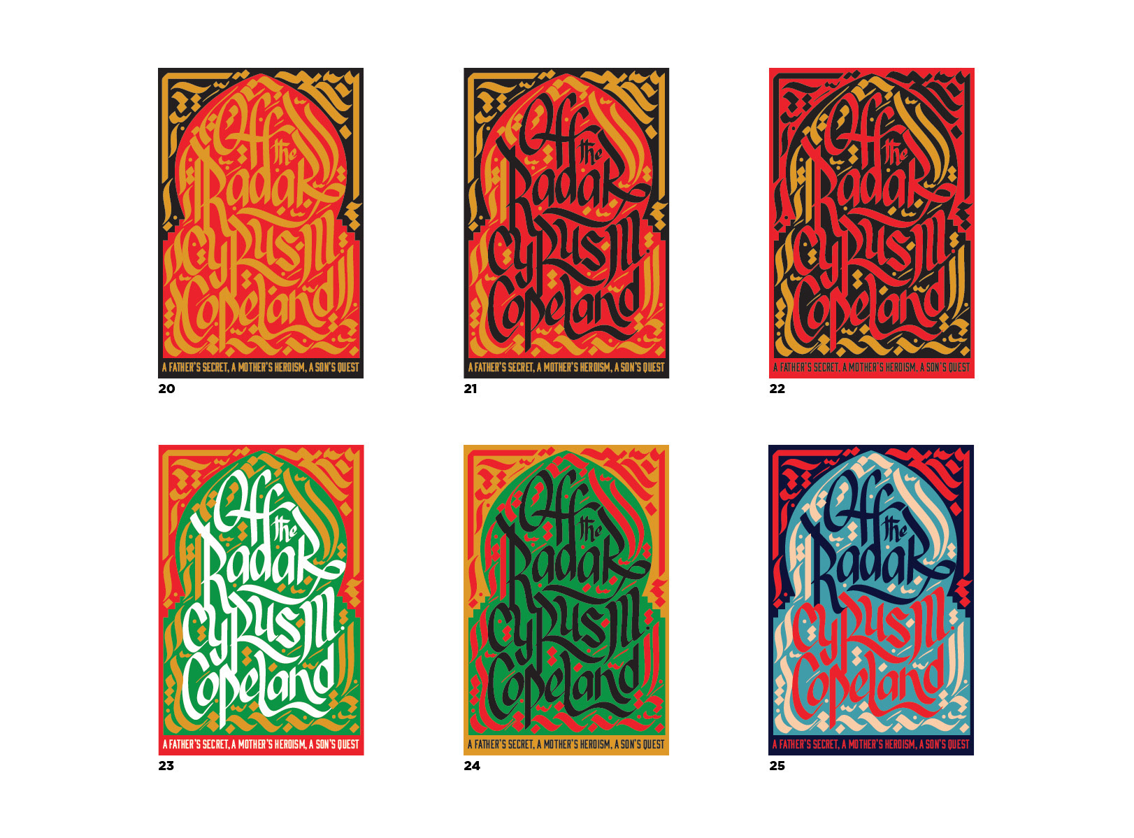
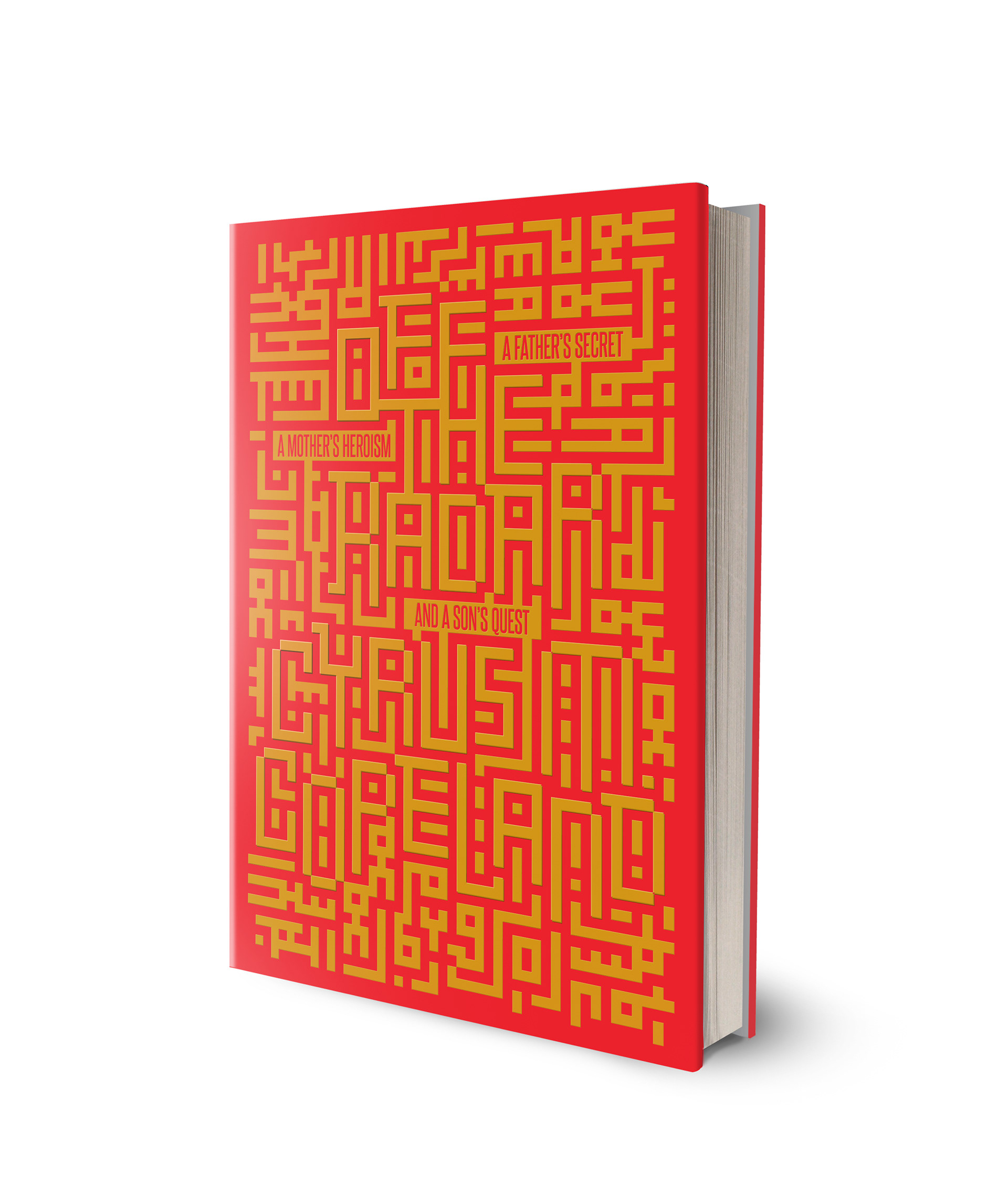
I also created a second option with a different approach based on geometric ornaments from Islamic architecture to 'hide' the typography.
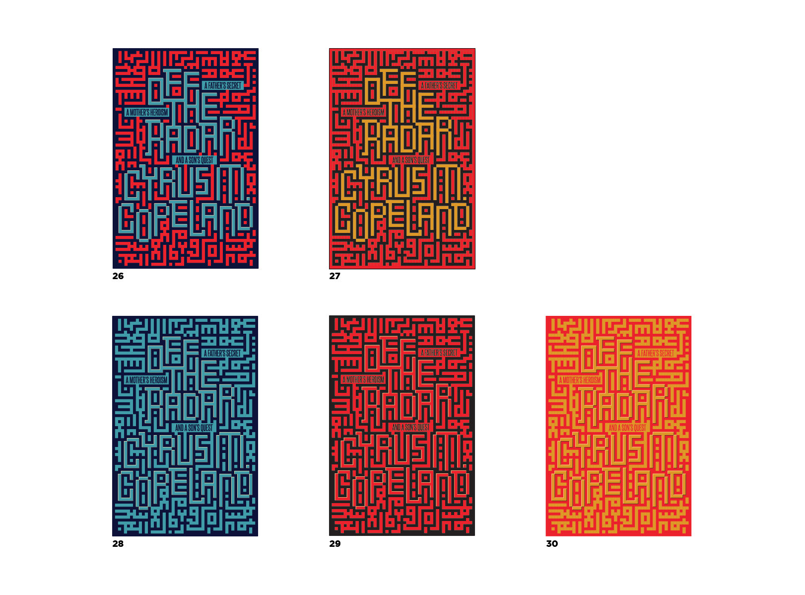
I mocked up two designs the author liked.
The iteration process for the final book cover was exhaustive. I worked with the author and Art Director to come up with the perfect solution after so many revisions.