Client: Parity AI
Project: Brand identity for a new AI app that checks other AI apps for biases
Project: Brand identity for a new AI app that checks other AI apps for biases
BRIEF:
Create a brand identity for Parity, an AI app that checks other AI apps for biases. Parity is a b2b platform that helps companies make ethical decisions by identifying and mitigating risk and harm, enabling positive impact of AI/ML systems.
They wanted to establish themselves as a serious AI company.
The initial step was to get on a discovery call I set up with the founders.
SOLUTION:
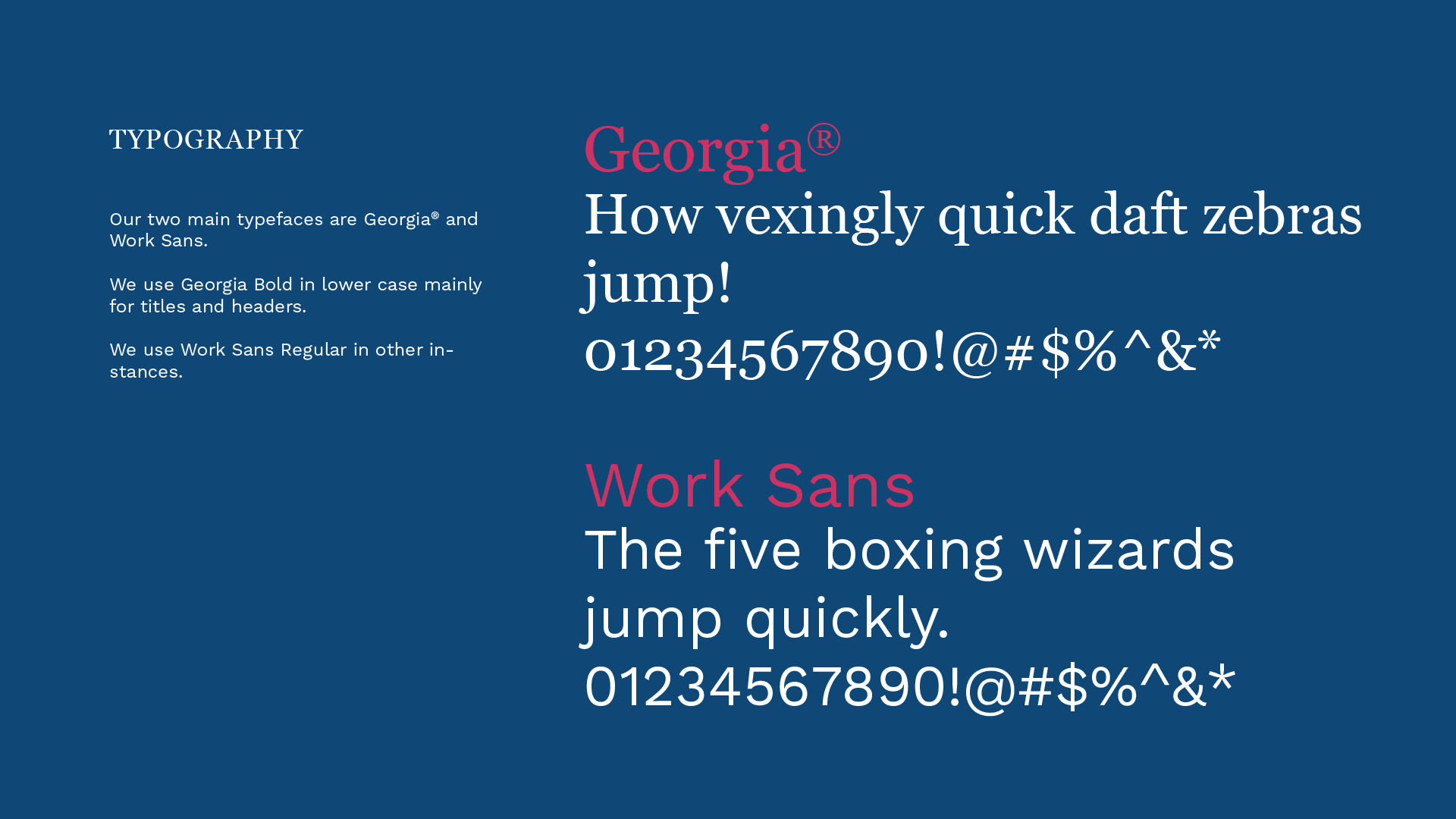
The discovery call was a great way to understand the founder's reason for starting her company and building this platform. It also gave me an opportunity to learn more about AI and the work they were trying to do. From our interview, the founder wanted something that was formal, technical, serious, and minimal.
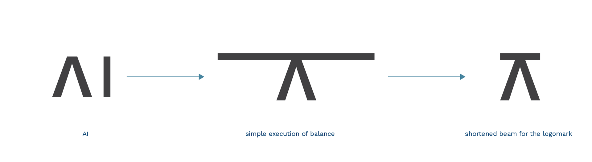
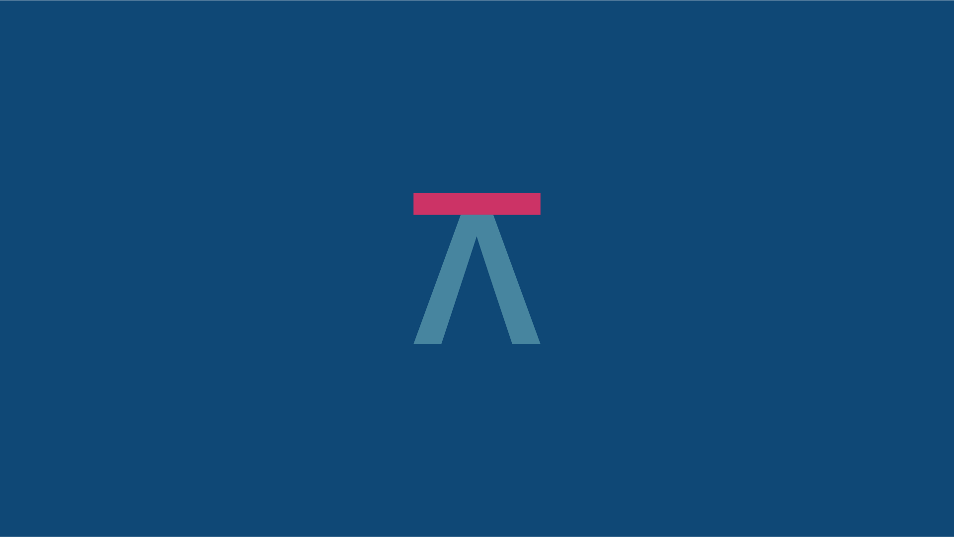
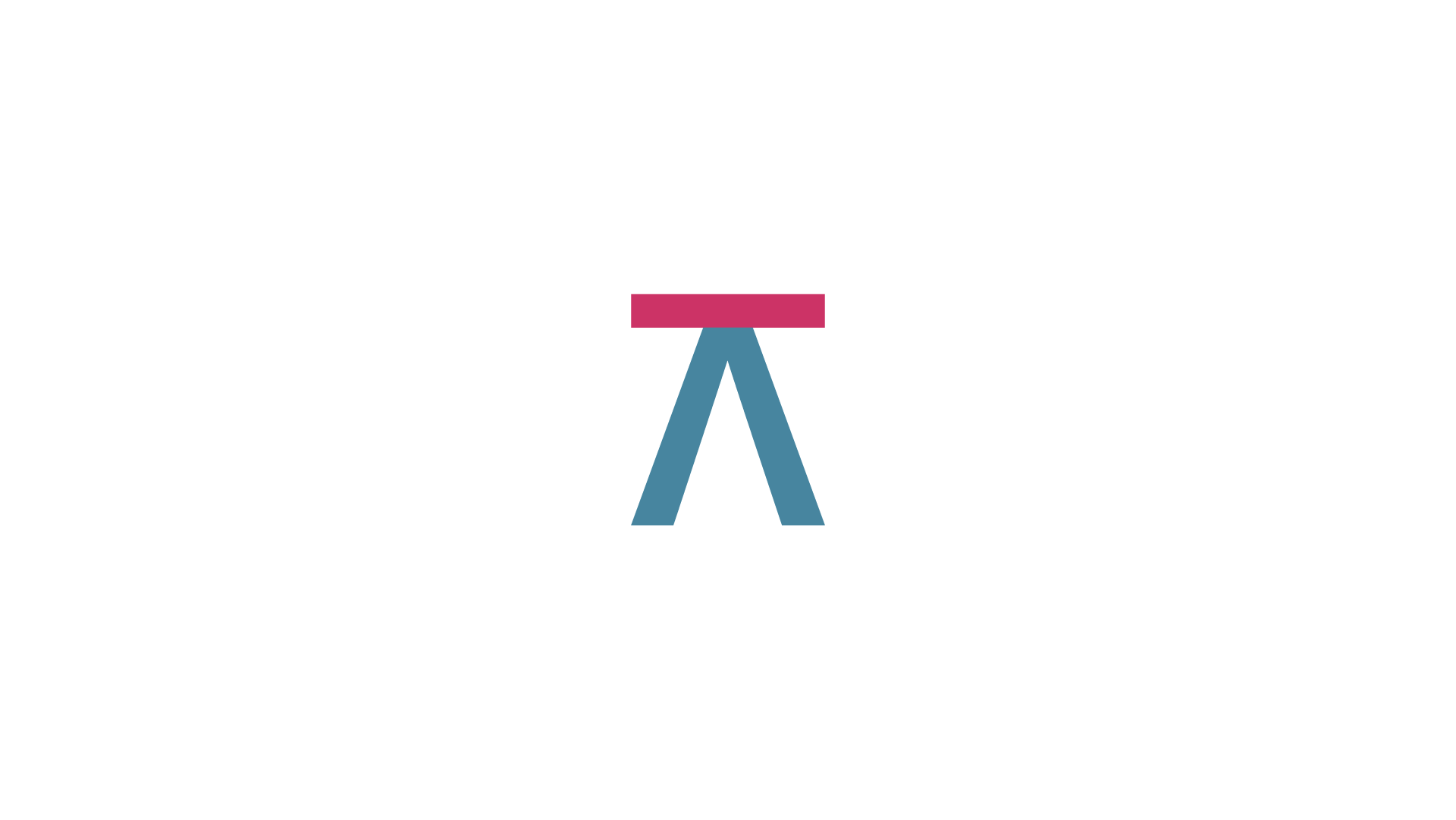
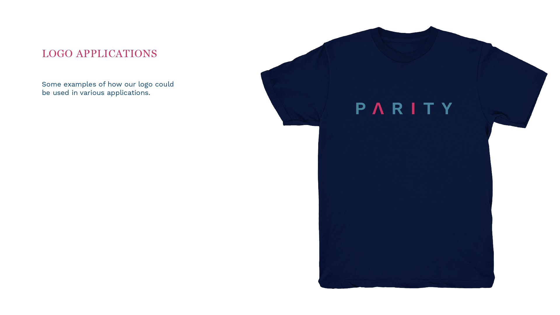
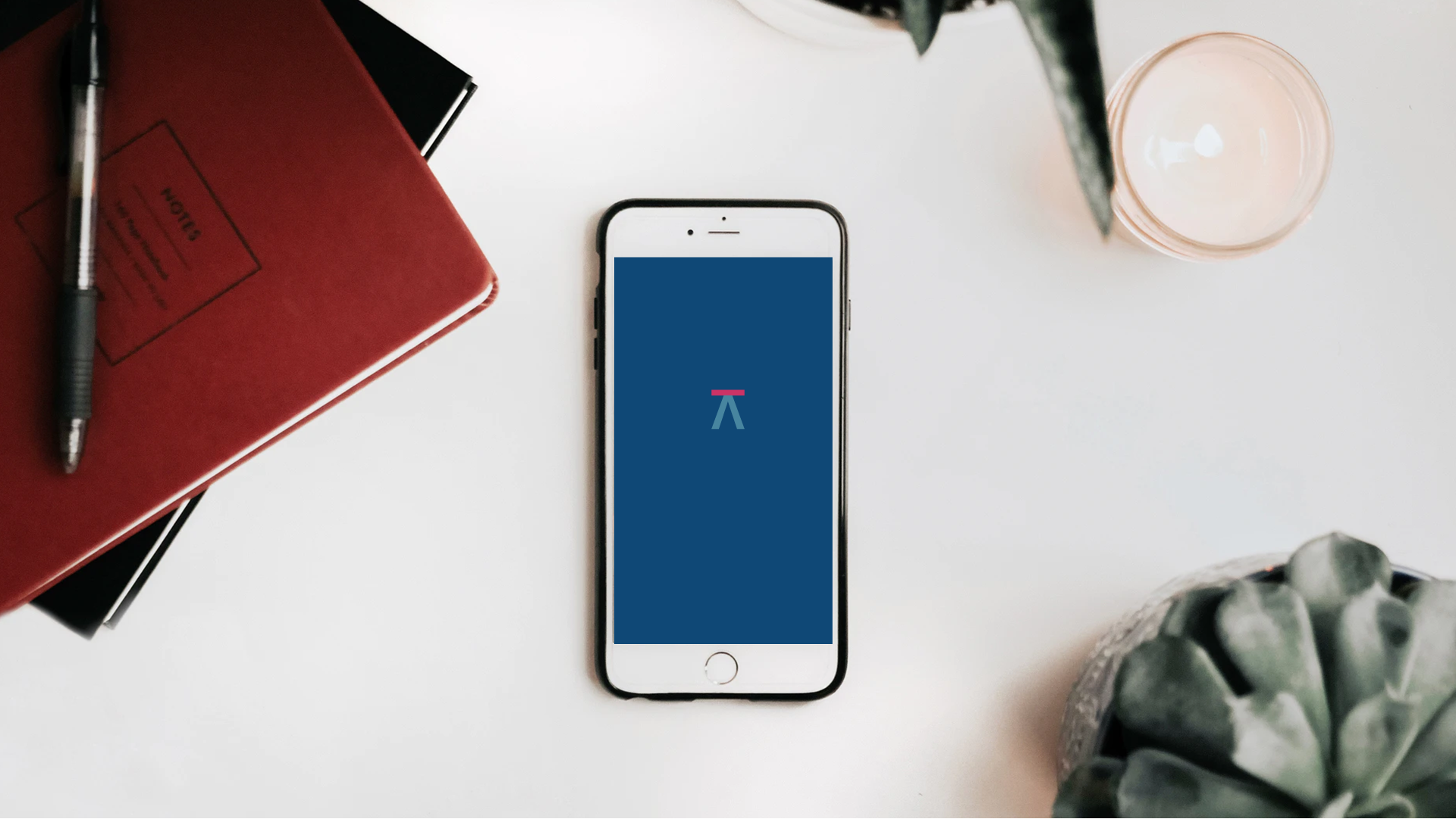
My solution is based on the meaning of 'parity' , "the state of being equal", visualizing that meaning through a simple balance made from the letters 'AI', as shown below.
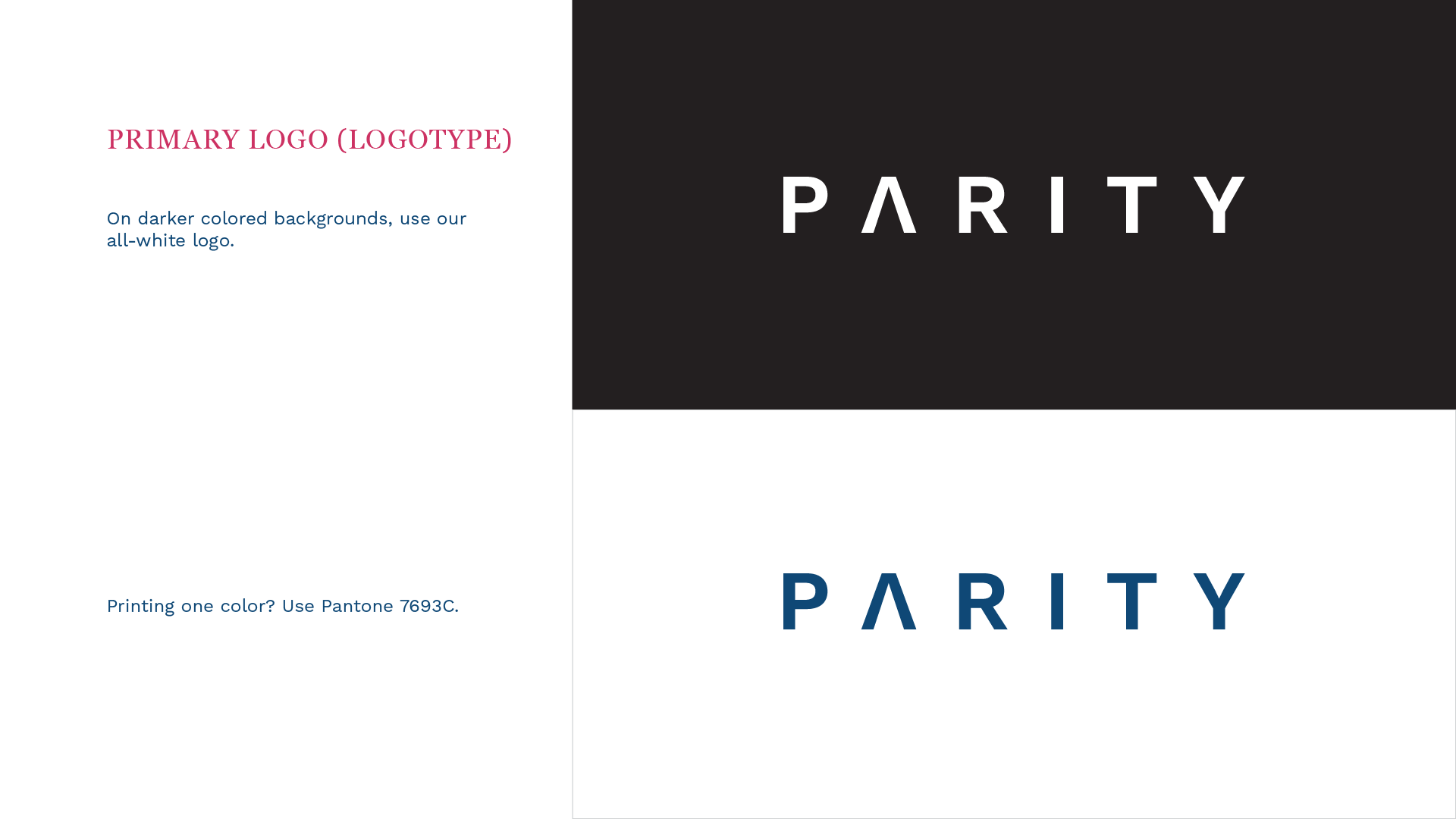
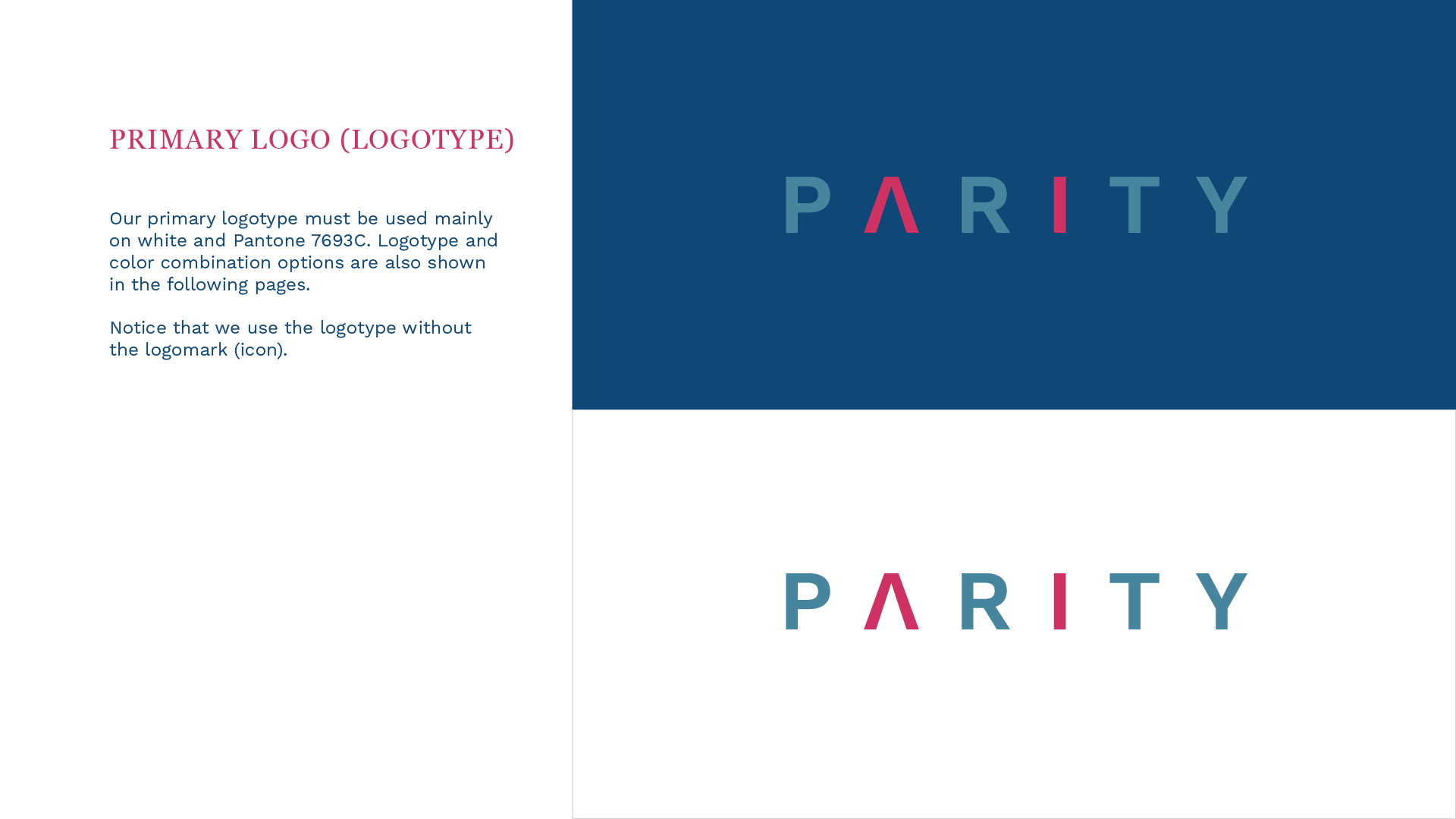
I initially created a simple wordmark to go along with AI logomark but the client wanted to highlight AI on the wordmark as well. We agreed that having the wordmark and the logomark highlighting AI was a bit redundant. So the solution was to create a wordmark that served as the primary logo with the logomark as the secondary logo when the use of the wordmark was less effective (e.g. app icons, social media avatars, etc.).
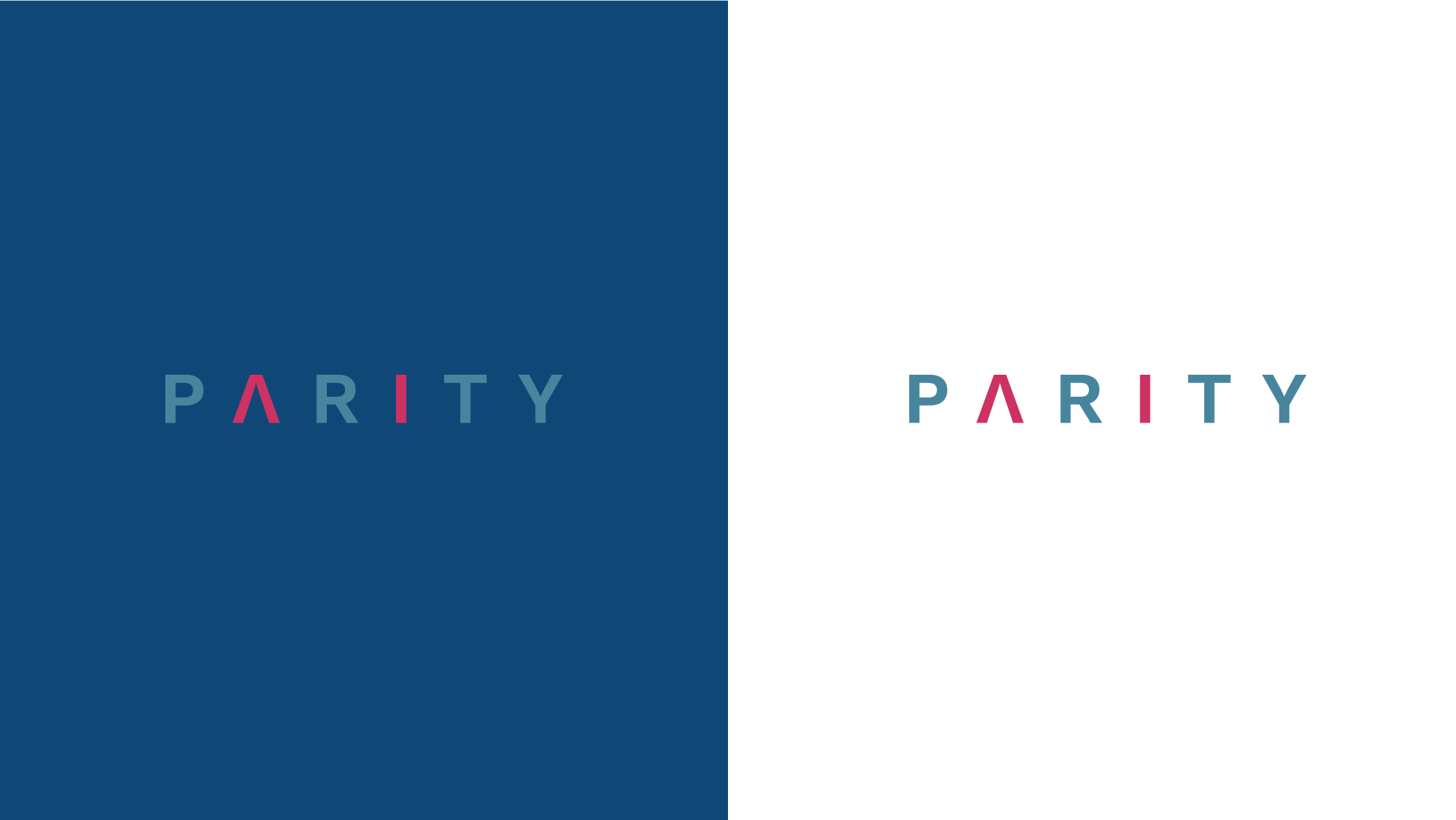
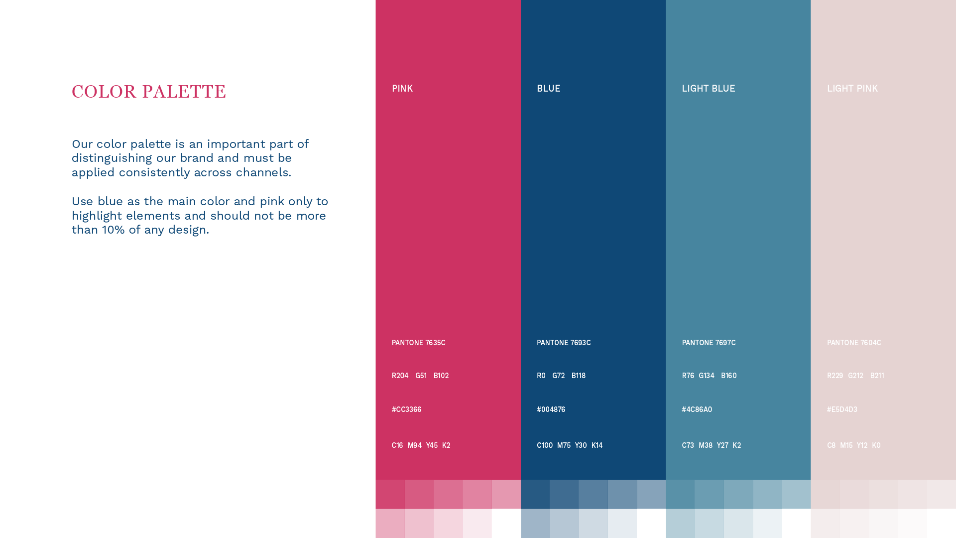
For color, even though the client wanted a serious blue tone, she also wanted to contrast that with a more playful pink. We both agreed to use it sparingly as a highlight color.
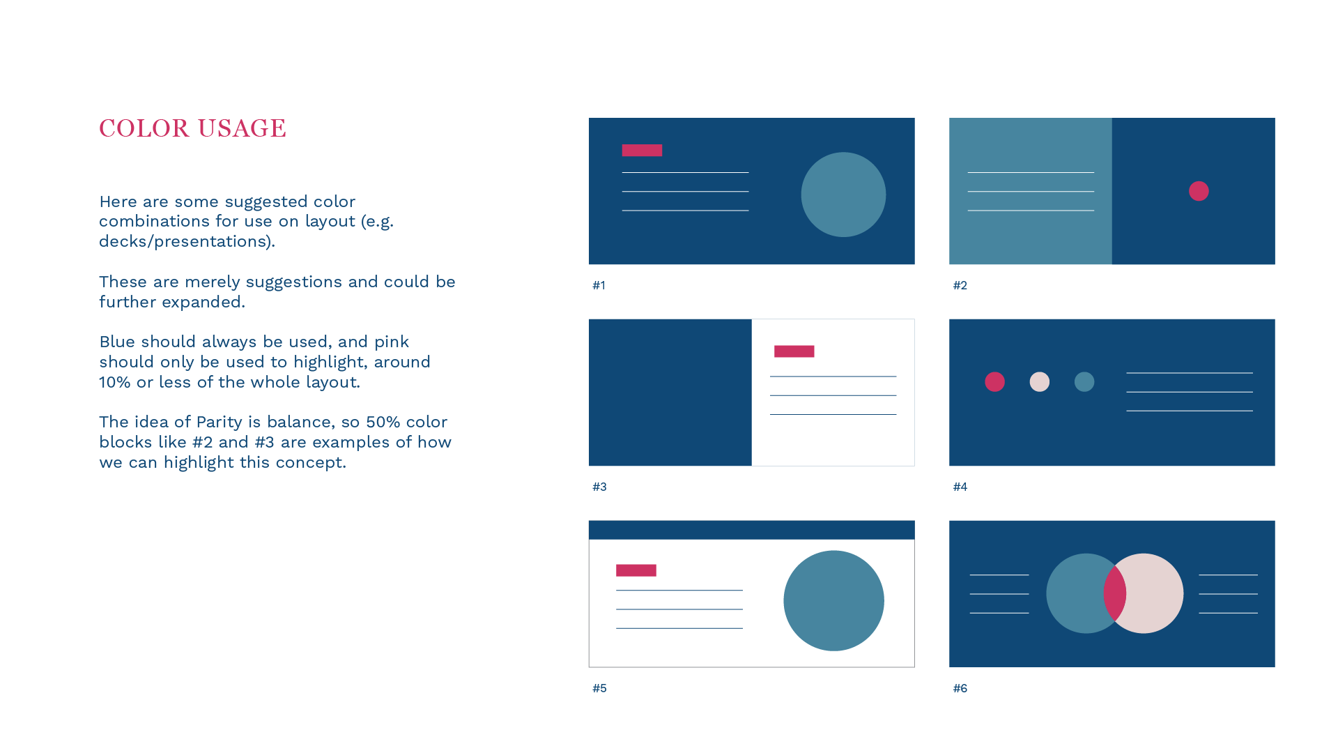
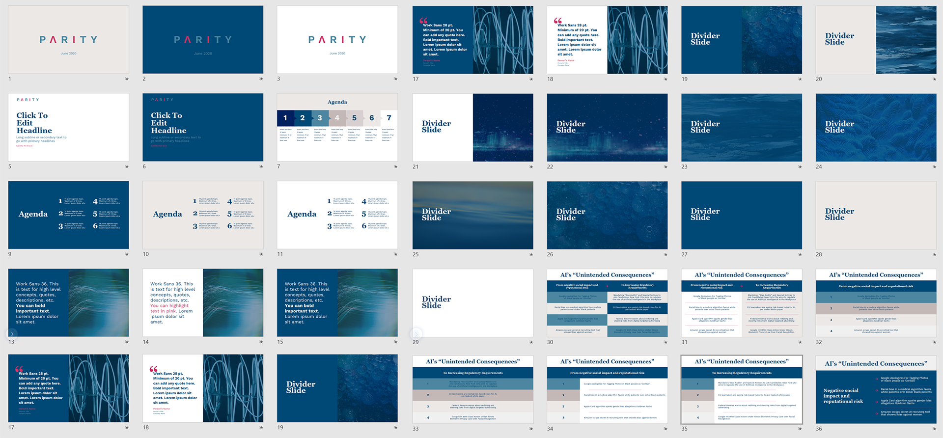
My other main task was to create a template for the company's deck. I created a 100-page template for the founders to use for various use cases. I believe they have raised some funding using this template.